Now, I have divided the article into two parts (because one is too mainstream):
the first part talks about things that you should do while designing a
logo, whereas the second one deals specifically with things you
shouldn’t. Sound good? Well then, let’s start!
1. When Designing a Logo Make Sure It’s Simple
There are a million ways I can tell you this, but, again, let’s keep it simple: Be simple!
Point
is, that a logo is not exactly a testing ground for your illustration
and typography skills. It is more a test of your design insight and
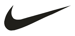
presentation sense. Let us look at the logo of Nike for that matter:
Most
of the time, the logo doesn’t even require a caption or the brand’s
name. But we know it is Nike the moment we look at it! They can use it
on sign boards and pamphlets, and even stop using their brand name
altogether, we still will not be confused about the brand’s identity.
That’s simplicity for you!
A complicated logo is not only difficult to identify, but also repeatedly fails in engaging the audience. A logo is an emblem, not a manifesto. Thus, it needs to be kept simple.
2. Make Your Logo Design Appeal To Different Audiences

Be
it design, art or even writing, flexibility and adaptability go a long
way in helping you succeed. To put it in other words, one needs to be
dynamic and not static. Being rigid in logo design only leads to no
scope for improvement and/or innovation, and when innovation dies, the
design also dies.
A
logo has to be dynamic. This does not mean that it has to change every
week, but it should have a flexible approach. Companies expect their
logo to appeal to a diverse spectrum of users. With such diversity, the
audience is bound to have different types of tastes and preferences. A
rigid logo means if you hate it, you hate it! That does not work in
design.
3. Make Sure Your Logo Design Is Versatile
Being
versatile goes a long way in making a logo design popular. If your logo
is such that it looks great on posters, but horrible on coffee mugs, it
will never achieve popularity.
Further more, if your logo is a
slave to a color scheme, it cannot be called a good logo either — what
this means is that a logo should look good even if it is displayed in
black and white, or a set of colors that are not part of the original or
actual design.
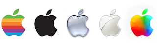
Take a look at Apple’s logo, for instance, that
can look good irrespective of the color scheme. This is versatility in
logo design portrayed at its very best!
4. Don’t Copy, Inspire – Design a Unique Logo

This is one of those oft-said but rarely followed tips. How does a logo rise to prominence as a brand’s identity? Simple! By being uniquely identifiable.

Again, let us turn to Apple’s logo. To put things
into perspective, here is a simple, perfectly awesome, good to eat,
chemical-free and absolutely healthy apple for you:
Here’s an absolutely healthy apple for you:
Seems tasty? Probably. Seems unique? Nope!
Now, let’s take a bite out of it and see what we get:
Ah………now that’s unique!
Literal
interpretations apart, I think the point is clear. As you can see, a
minor change has transformed an otherwise dull apple into one of the
most iconic logo images today! This is how one achieves uniqueness:
instead of trying too hard, the aim is to think out-of-the-box, and
bring mundane objects into the mold of uniqueness.
To be frank, this is the real test of your creative abilities.
5. Make Sure Your Logo Design Has A Story To Tell

Every
logo has a story to tell. If you view a logo as mere artwork or a
pattern of lines and/or text, you will not be able to unravel the deeper
meaning behind the logo. Ideally, a good logo has two stories to tell:
one, the obvious one, and second, the hidden one.
Generally clients will come to you asking for a cool and mind-blowing logo. “Cool and mind-blowing” does not mean Superman here (though if your logo has superpowers, such as the ability to fly or prepare coffee, +5 points for that!).
Basically,
if you can show your clients that the logo you have designed is not
simply a shallow piece of artwork but consists of deep thinking and
meticulous ideology, they’ll love it, even if it is something simple.
Talking about meaningful, let us take, for example, Toyota’s logo.
The
logo is not simply three distinct ovals with a fancy ‘T’. According to
Toyota, each of the three ovals has its own meaning; the center ovals
(overlapping) represent the faith and trust between the company and its
customers, whereas the outer (encircling) oval represents the global
expansion plans of Toyota.
The negative space complements the
encircling oval by expressing the infinite reach of the company and the
overall logo, put together, represents a steering wheel which is,
obviously, symbolic of cars.
0 comments :
Post a Comment