Now, I have divided the article into two parts (because one is too mainstream):
the first part talks about things that you should do while designing a
logo, whereas the second one deals specifically with things you
shouldn’t. Sound good? Well then, let’s start!
1. Do Not Underestimate Color In Your Logo Design
Colors
form the essence of any visual representation. Often times, designers
tend to overlook the importance of a judicious use of colors (this can
probably be attributed to the misunderstood notion of ‘clean’ design
wherein the only permissible color is the white space).
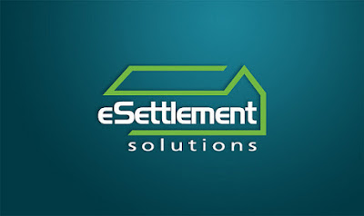
Pictured: Logo for eSettlement Solutions
Colors
have the power to affect feelings and emotions. Ideally, your choice of
color should be made on the basis of the target demographic of
customers. Consider the age, gender and cultural orientations of the
target audience, and couple it with your artistic creativity, and you’ve
got a killer color palette for your logo already!
2. Do Not Over Innovate: Don’t Fall in Cool Logo Creation Trap
This
point works in assonance with the “Be Simple” rule above. Innovation is
a wonderful thing; you can work around, experiment, and come up with
the killer idea for your logo. This is how artists work!
However,
everything has its own share of limits. You innovation abilities
definitely are limitless, but their practical usage is often a victim of
the innovation possibilities that are provided by a given product.
Excess experimentation can result in a logo that is gorgeous to look at,
but is not identifiable with the company itself. Remember: a logo is
not an art masterpiece.
Instead, your aim should be to make the
logo both identifiable and easily associated with the brand. At the end
of the day, your design should be something the customers can identify
and the company can ‘own’. If you can accomplish that, your logo design
is a success, irrespective of it being generic or innovative.

Take
a look at Opera’s logo, for example. Just a red ‘O’, and people know
that it belongs to Opera. Innovation lies here in the shape of the ‘O’:
the flat-bulge (I wonder if that’s an acceptable word to describe it), and that’s it!
3. Don’t Underestimate Custom Typography In Your Logo Design
The first part, yes. But the second part, NO.
When
it comes to logo design, your typeface should be unique. A custom
hand-drawn typeface is way better than most gorgeous fonts anyway.
“I know it! Nothing can match a gorgeous and drop-dead beautiful font, and since there are thousands of them out there, I just have to spend time choosing which one to use!”
If nothing else, it
keeps the design plagiarists at bay (because if it is not a custom
typeface, once your font is discovered, your logo will be ripped within
minutes). Thus, custom lettering should be the preferred way.
Plus,
custom lettering is far more identifiable in a logo than a font that
you purchased and/or downloaded off the internet. Remember Coca-Cola,
anyone?

4. Do Not Be Predictable: Create Smart Logo Designs
Basically,
make sure your logo is worth-watching (and, like I said above, tells a
story). On first look, your logo should convey the brand’s identity.
Nothing too loud though, such that if your logo is about a firm that
makes umbrella, it shouldn’t shout out “RAIN”.
Note: This does not mean you should surprise your clients by increasing the design cost at random or by postponing deadlines.
Thereafter,
on a deeper look, your logo should also be suggestive of something:
again, if talking about an umbrella firm, it should be suggestive of
weather, but refrain from mentioning rain or sunlight (generally
speaking, that is, as there isn’t a norm for this).
Let’s turn our
attention to the Lion Bird logo. Look at it, and tell me what do you
see on first look? A colorful bird, with the brand name, right? Now look
closer. You’ll see that if you stare at the bird’s feet, a lion’s face
is visible within the logo. Neat, eh?

If you stare at the bird’s feet, a lion’s face is visible within the logo.
5. Top Logo Design Tip: Don’t Fall For Cliche – Be Different
Quick, recall the number of logos you’ve seen that employ either Helvetica or Papyrus.
When
it comes to logo design, it pays to be unique (already discussed the
reasons in the first segment above). Logo design, just like any other
variant of design, has its own share of trends which keep falling in
favor and out of favor over time. It makes sense to steer clear of
cliches and give your clients the unique logo that they expect from you.
Now, if you are looking for more logo inspiration, you should check out our latest article – 350 Simple, Smart Logo Ideas And Examples.
0 comments :
Post a Comment